What is dithering in pixel art? (And when to use it)
Dithering fakes extra colors by mixing pixels. Learn how ordered and Floyd–Steinberg dithering work, how they differ, and when each one makes your pixel art look better.
4 min read
Cut a photo down to 16 colors and something ugly usually happens: smooth skies, skin and shadows break into hard stripes of flat color. This is called banding, and it’s the main reason converted photos can look cheap.
Dithering is the classic fix. Instead of filling an area with the single closest color, it mixes pixels of two or more palette colors so that, from a normal viewing distance, your eye blends them into a shade the palette doesn’t actually have.
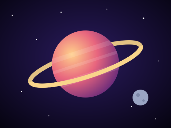
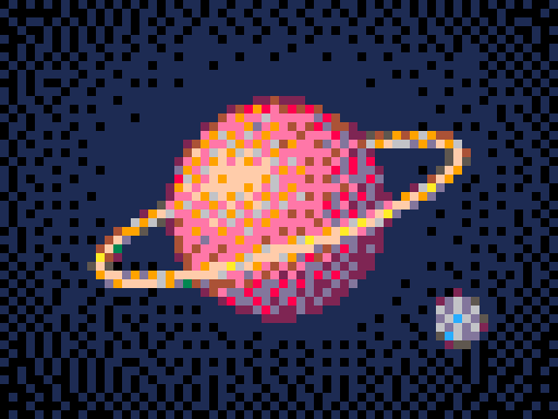
Why dithering works
Your eyes average small details together. Newspapers have used the same trick for over a century: a printed photo is really a pattern of tiny dots in a few inks, and you see smooth grays and skin tones.
Old computers and consoles leaned on it heavily because they could only show a handful of colors at once. On the Sega Genesis, for example, developers often drew vertical stripes of two colors and let the blur of a CRT television blend them into a new color or a fake transparency effect.
The two main kinds of dithering
There are many dithering algorithms, but almost all of them fall into one of two families.
Ordered dithering (“Pattern”)
Ordered dithering compares each pixel against a small, repeating grid of thresholds called a Bayer matrix. Depending on where a pixel sits in that grid, it’s nudged slightly lighter or darker before it’s matched to the palette. Our converter uses a 4×4 Bayer matrix.
The result is a regular, cross-hatched texture that looks deliberately retro, much like the shading in many 8-bit and 16-bit games.
- Good for: a strong retro look, shading on sprites and game art, and animation. Because the pattern is fixed to the grid, it doesn’t flicker from frame to frame.
- Watch out for: the visible texture. On photos with lots of fine detail, the pattern can compete with the picture.
Error diffusion (“Smooth”)
Error diffusion works one pixel at a time. It picks the closest palette color, measures how far off that choice was (the “error”), and pushes that error onto the neighboring pixels that haven’t been processed yet. If one pixel came out too dark, the next ones lean lighter to make up for it.
The best-known version is Floyd–Steinberg dithering, published by Robert Floyd and Louis Steinberg in 1976. It spreads the error to four neighbors: 7/16 to the pixel on the right, and 3/16, 5/16 and 1/16 to the three pixels below.
- Good for: photos, gradients, faces and anything where you want to keep as much detail and tone as possible.
- Watch out for: a grainy, noisy look in flat areas, and lots of isolated single pixels.
Other well-known algorithms include Atkinson dithering (made famous by the original Apple Macintosh), Sierra and Jarvis–Judice–Ninke. They’re variations on error diffusion that trade off contrast, grain and speed.
When to use dithering (and when not to)
| Image | Dithering | Why |
|---|---|---|
| Photos, landscapes, portraits | Smooth | Keeps gradients and skin tones without banding. |
| Game sprites, retro scenes | Pattern | Gives the classic textured shading of old games, and stays stable in animation. |
| Logos, icons, flat illustrations | Off | They’re already made of flat colors. Dithering only adds noise to clean edges. |
| Very small art (16×16, 32×32) | Off | At tiny sizes, every pixel matters and dithered pixels read as dirt. |
| Cross-stitch, bead and crochet patterns | Off | Dithering creates many single stitches or beads of different colors, which is slow to make. |
A good rule of thumb: the fewer colors you have, the more dithering helps. With a 4-color Game Boy palette it can make a huge difference. With 48 or 64 colors there’s usually little banding left to fix, so turning dithering off gives a cleaner result.
It’s also worth knowing that many pixel artists who draw by hand use dithering sparingly, in small transition zones between two colors, rather than across the whole image. A converter can’t make that judgment for you, so if a dithered result looks too busy, try fewer colors without dithering, or clean up the noisy areas by hand afterwards.
How to try it
- Open the image to pixel art converter and upload a picture, or pick one of the samples.
- Choose a limited palette: a retro palette such as PICO-8 or Game Boy, or Automatic with 8 to 16 colors. (Dithering isn’t available with the Original palette, which keeps every color.)
- Under Dithering, switch between Off, Smooth and Pattern. The preview updates instantly.
- Drag the compare slider to check the result against your original, then download your PNG.
Try the same image with all three settings. Gradients and shadows are where you’ll see the biggest difference.